Elevating Onboarding for a B2B Inventory Platform
Solo end-to-end project: user research, UX recommendations, prototype, and implemented designs for a B2B marketplace.
Solo project redesigning onboarding for a B2B marketplace. Ran three user interviews, identified friction in the data import flow, contextual prompt engagement, and the absence of a completion moment. Designed a behavior-triggered, checklist-based onboarding flow with contextual prompts tied to four key milestones.
Background
This was a solo MBA internship project for a B2B SaaS marketplace where the core value is collaborative: both sides of the market need to complete meaningful actions before the platform delivers value. That meant onboarding had to make a multi-step, relationship-dependent process feel achievable on day one, not just get users past signup.
I took on the project end-to-end, delivering research, UX recommendations, a prototype, and implemented screen designs.
The Problem
B2B onboarding fails the same way almost every time: it asks users to set things up before they have any idea what the product actually does. Static tours get closed. Tooltips go unread. People either grind through out of obligation or drop off before hitting the moment that would have made them stay.
The users on this platform are mostly directors rolling out a tool for their teams. They're busy, they learn by doing, and they have low patience for anything that slows them down. Getting them to feel capable fast matters more than walking them through features.
The core tension: making onboarding feel effortless while ensuring users actually complete the steps that make the product valuable.
Research
I ran three user interviews, walking participants through the existing onboarding flow.
The high-level structure was well received. Users described it as non-overwhelming, and the progress indicator gave them a sense of footing. Contextual prompts tied to completed actions felt well-timed rather than pushy.
The friction points were specific:
- A complex data import step created confusion: users lacked enough context about field requirements to complete it confidently
- Contextual prompts were dismissed before users engaged with them. Users at this seniority level learn by doing, not reading
- There was no completion moment: users finished the checklist and felt nothing close to done
Design Approach
The recommendation centered on behavior-triggered guidance rather than static tours. Milestone-triggered prompts achieve significantly higher feature adoption because they meet users at the moment of readiness, after they've taken an action, rather than front-loading information before they have context to use it.
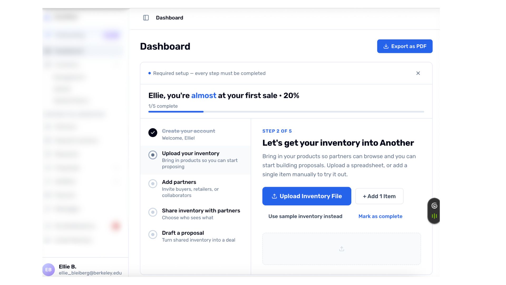
The proposed flow moves through four anchored moments, each surfacing the next one contextually rather than presenting everything upfront.
The checklist on the home page is minimizable, auto-minimizes after several visits, requires the user to actually complete steps for items to check off, and disappears entirely once finished.
Signup-level recommendations
I also included recommendations at the signup stage. Framing early questions around intent rather than identity ("what can we help you do?" rather than "who are you?") reduces the feeling of administrative setup. Surfacing a preview of potential matches during signup gives the platform an opportunity to demonstrate value before the user has committed anything real.
Designing with Claude
I used Claude as a design tool throughout this project, not as a shortcut but as an active part of the process. I used it to generate and iterate on prototype screens, stress-test the flow logic by describing edge cases and asking where it would break, and sharpen the recommendation language so it read at the right level for a B2B audience.
Working this way made the solo process faster without flattening the thinking. The decisions about what to include, what to cut, and how to sequence the flow were still mine. Claude handled execution speed so I could spend more time on judgment.
What Was Delivered
- Research synthesis from three user interviews
- UX recommendation deck covering the onboarding flow and signup experience
- Prototype of the proposed checklist-based dashboard and contextual prompt system
- Implemented screen designs showing the home page with progress tracking and side navigation with onboarding integration
Reflection
The core insight from this project is that onboarding fails when it mistakes arrival for readiness. The platform's users are time-poor directors who learn by doing, not reading. Guidance only lands when it's tied to a moment the user has already earned through action. Milestone-triggered prompts work precisely because they meet users at the point of relevance: after one key action, the next becomes the obvious move.
The harder question this project left open is how much nudging is too much. A checklist that auto-minimizes and requires real task completion respects user autonomy, but if users skip too readily, they never reach the collaboration moment that makes the platform worth returning to. That calibration is ultimately a data question, and the right answer will only emerge from watching what users actually do.